Since a couple of weeks my team is using the new (preview) style Neo4j Browser, version: apps/query/2025.05.06+0.
We are not that happy about certain things. We hope something can be done about the following items:
When double clicking a Node it expands. Great. But when double clicking again, it does not collapse. This was an option in the old-style browser. Please consider re-introducing this option.
Node and Relationship names are truncated. Node names after 25 characters or so, and relationship names after 20 characters or so. Please consider making this configurable or increase the size with a decent amount.
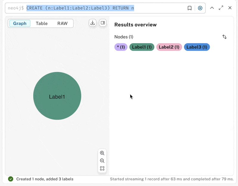
When executing a query like this (assuming A and B exist):
MATCH (n:A) - - (m:B) RETURN n,m LIMIT 1;
Then the preview version will display just 2 separate nodes without a relationship, while the old version would display the 2 nodes with it's relationship.
IMHO I see what the app is doing -> showing you what you are actually "returning". And if you want to see the relationships, then return them too.
Hey there, Product Manager for browser here :)
Indeed, this was a conscious change, too many people got confused in old browser with us automatically connecting things making debugging queries hard when the visualization showed things you weren'te explicitly returning. There used to be an option to turn off auto-connect which a lot of people turned off. We now have a right-click context menu if you want to connect-up all the nodes in your visualization on-demand. Browser is a developer tool so we feel it's more important to render what you're explicitly returning, but open to more feedback on this.
Before, I assume that the Desktop app picked up the "last" label added and would allow me to see the Persons, the Employees, the Bosses and the Friends ... now everyone is only a person!
Docs for the new browser are in progress, but in the meantime see the attached anigif for an illustration of how to set the priority of labels used for styling.
Oh, was already wondering why the old browser has features the new one doesnt. Why is the default priority ordering different for the new browser though?
I find it quite unintuitive. It is also only possible from the overview after making a query, if you click on a node, the possibility to reorder priorities is gone. Just realized you can get back to overview by clicking into the background. Maybe we could have the button for the priority selection on the database overview on the left hand side though?